rnorm(1, mean = 0, sd = 1)[1] 0.1623273Reading: 7 minute(s) at 200 WPM
Videos: 48 minutes
This chapter is heavily from Dr. Theobold’s course-page material.
In statistics, we often want to simulate data (or create fake data) for a variety of purposes. For example, in your first statistics course, you may have flipped coins to “simulate” a 50-50 chance. In this section, we will learn how to simulate data from statistical distributions using R.
Functions like rnorm() rely on something called pseudo-randomness. Because computers can never be truly random, complicated processes are implemented to make “random” number generation be so unpredictable as to behave like true randomness.
This means that projects involving simulation are harder to make reproducible. For example, here are two identical lines of code that give different results!
rnorm(1, mean = 0, sd = 1)[1] 0.1623273rnorm(1, mean = 0, sd = 1)[1] -0.3184077Fortunately, pseudo-randomness depends on a seed, which is an arbitrary number where the randomizing process starts. Normally, R will choose the seed for you, from a pre-generated vector:
head(.Random.seed)[1] 10403 4 -1176886906 -2143185136 501511091 -535777199However, you can also choose your own seed using the set.seed() function. This guarantees your results will be consistent across runs (and hopefully computers):
Of course, it doesn’t mean the results will be the same in every subsequent run if you forget or reset the seed in between each line of code!
[1] -1.207066## Calling rnorm() again without a seed "resets" the seed!
rnorm(1, mean = 0, sd = 1)[1] 0.2774292It is very important to always set a seed at the beginning of a Quarto document that contains any random steps, so that your rendered results are consistent.
Note, though, that this only guarantees your rendered results will be the same if the code has not changed.
Changing up any part of the code will re-randomize everything that comes after it!
When writing up a report which includes results from a random generation process, in order to ensure reproducibility in your document, use `r ` to include your output within your written description with inline code.
my_rand <- rnorm(1, mean = 0, sd = 1)
my_rand
[1] 1.084441Using r my_rand will display the result within my text:
My random number is 1.0844412.
Alternatively, you could have put the rnorm code directly into the inline text r rnorm(1, mean = 0, sd = 1), but this can get messy if you have a result that requires a larger chunk of code.
The code below creates a tibble (read fancy data frame) of 100 heights randomly simulated (read drawn) from a normal distribution with a mean of 67 and standard deviation of 3.
set.seed(93401)
my_samples <- tibble(height = rnorm(n    = 100,
                                    mean = 67,
                                    sd   = 3)
                     )
my_samples |>
  head()
# A tibble: 6 × 1
height
<dbl>
1 63.1
2 66.7
3 68.2
4 63.4
5 68.9
6 71.4To visualize the simulated heights, we can look at the density of the values. We plot the simulated values using geom_histogram() and define the local \(y\) aesthetic to plot calculate and plot the density of these values. We can then overlay the normal distribution curve (theoretical equation) with our specified mean and standard deviation using dnorm within stat_function()
my_samples |>
  ggplot(aes(x = height)) +
  geom_histogram(aes(y = ..density..),
                 binwidth = 1.75,
                 fill = "grey"
                 ) +
  stat_function(fun = ~ dnorm(.x, mean = 67, sd = 3),
                col = "cornflowerblue",
                lwd = 2
                ) +
  xlim(c(55, 80))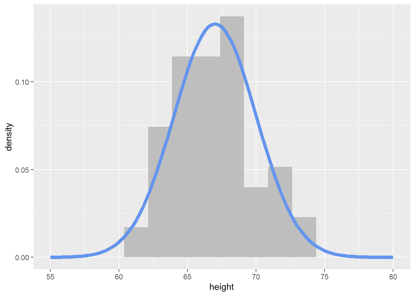
You now have the skills to import, wrangle, and visualize data. All of these tools help us prepare our data for statistical modeling. While we have sprinkled some formal statistical analyses throughout the course, in this section we will be formally reviewing Linear Regression. First let’s review simple linear regression. Linear regression models the linear relationship between two quantitative variables.
Recommended Reading – Modern Dive : Basic Regression
Handy function shown in the reading! skim from the skimr package.
To demonstrate linear regression in R, we will be working with the penguins data set.
library(palmerpenguins)
data(penguins)
head(penguins) |>
kable()| species | island | bill_length_mm | bill_depth_mm | flipper_length_mm | body_mass_g | sex | year |
|---|---|---|---|---|---|---|---|
| Adelie | Torgersen | 39.1 | 18.7 | 181 | 3750 | male | 2007 |
| Adelie | Torgersen | 39.5 | 17.4 | 186 | 3800 | female | 2007 |
| Adelie | Torgersen | 40.3 | 18.0 | 195 | 3250 | female | 2007 |
| Adelie | Torgersen | NA | NA | NA | NA | NA | 2007 |
| Adelie | Torgersen | 36.7 | 19.3 | 193 | 3450 | female | 2007 |
| Adelie | Torgersen | 39.3 | 20.6 | 190 | 3650 | male | 2007 |
When conducting linear regression with tools in R, we often want to visualize the relationship between the two quantitative variables of interest with a scatterplot. We can then use either geom_smooth(method = "lm") (or equivalently stat_smooth(method = "lm") to add a line of best fit (“regression line”) based on the ordinary least squares (OLS) equation to our scatter plot. The regression line is shown in a default blue line with the standard error uncertainty displayed in a gray transparent band (use se = FALSE to hide the standard error uncertainty band). These visual aesthetics can be changed just as any other plot aesthetics.
penguins |>
  ggplot(aes(x = bill_depth_mm,
             y = bill_length_mm
             )
         ) +
  geom_point() +
  geom_smooth(method = "lm") +
  labs(x = "Bill Depth (mm)",
       subtitle = "Bill Length (mm)",
       title = "Relationship between penguin bill length and depth"
       ) +
  theme(axis.title.y = element_blank())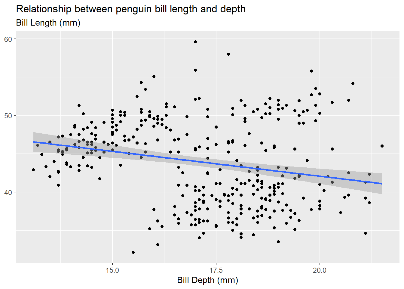
Be careful of “overplotting” and use geom_jitter() instead of geom_point() if your data set is dense. This is strictly a data visualization tool and will not alter the original values.
In simple linear regression, we can define the linear relationship with a mathematical equation given by:
\[y = a + b\cdot x\]
Remember \(y = m\cdot x+b\) from eighth grade?!
where
Remember “rise over run”!
In statistics, we use slightly different notation to denote this relationship with the estimated linear regression equation:
\[\hat y = b_0 + b_1\cdot x.\]
Note that the “hat” symbol above our response variable indicates this is an “estimated” value (or our best guess).
We can “fit” the linear regression equation with the lm function in R. The formula argument is denoted as y ~ x where the left hand side (LHS) is our response variable and the right hand side (RHS) contains our explanatory/predictor variable(s). We indicate the data set with the data argument and therefore use the variable names (as opposed to vectors) when defining our formula. We name (my_model) and save our fitted model just as we would any other R object.
my_model <- lm(bill_length_mm ~ bill_depth_mm,
               data = penguins
               )
Now that we have fit our linear regression, we might be wondering how we actually get the information out of our model. What are the y-intercept and slope coefficient estimates? What is my residual? How good was the fit? The code options below help us obtain this information.
This is what is output when you just call the name of the linear model object you created (my_model). Notice, the output doesn’t give you much information and it looks kind of bad.
my_model
Call:
lm(formula = bill_length_mm ~ bill_depth_mm, data = penguins)

Coefficients:
  (Intercept)  bill_depth_mm
      55.0674        -0.6498
This is what is output when you use the summary() function on a linear model object. Notice, the output gives you a lot of information, some of which is really not that useful. And, the output is quite messy!
summary(my_model)
Call:
lm(formula = bill_length_mm ~ bill_depth_mm, data = penguins)

Residuals:
     Min       1Q   Median       3Q      Max
-12.8949  -3.9042  -0.3772   3.6800  15.5798

Coefficients:
              Estimate Std. Error t value Pr(>|t|)
(Intercept)    55.0674     2.5160  21.887  < 2e-16 ***
bill_depth_mm  -0.6498     0.1457  -4.459 1.12e-05 ***
---
Signif. codes:  0 '***' 0.001 '**' 0.01 '*' 0.05 '.' 0.1 ' ' 1

Residual standard error: 5.314 on 340 degrees of freedom
  (2 observations deleted due to missingness)
Multiple R-squared:  0.05525,   Adjusted R-squared:  0.05247
F-statistic: 19.88 on 1 and 340 DF,  p-value: 1.12e-05
The tidy() function from the {broom} package takes a linear model object and puts the “important” information into a tidy tibble output.
Ah! Just right!
# A tibble: 2 × 5
  term          estimate std.error statistic  p.value
  <chr>            <dbl>     <dbl>     <dbl>    <dbl>
1 (Intercept)     55.1       2.52      21.9  6.91e-67
2 bill_depth_mm   -0.650     0.146     -4.46 1.12e- 5
If you are sad that you no longer have the statistics about the model fit (e.g., R-squared, adjusted R-squared, \(\sigma\)), you can use the glance() function from the broom package to grab those!
broom::glance(my_model)# A tibble: 1 × 12
r.squared adj.r.squared sigma statistic p.value df logLik AIC BIC
<dbl> <dbl> <dbl> <dbl> <dbl> <dbl> <dbl> <dbl> <dbl>
1 0.0552 0.0525 5.31 19.9 0.0000112 1 -1056. 2117. 2129.
# ℹ 3 more variables: deviance <dbl>, df.residual <int>, nobs <int>